Case study / 2021 – 2023 / Founding Product Designer
Rose HealthFrom post-MVP overhaul to acquisition
Rebuilding a mental-health app whose assessment completion had collapsed from 90% to 20%, and designing the system that kept every product surface coherent.
Some background
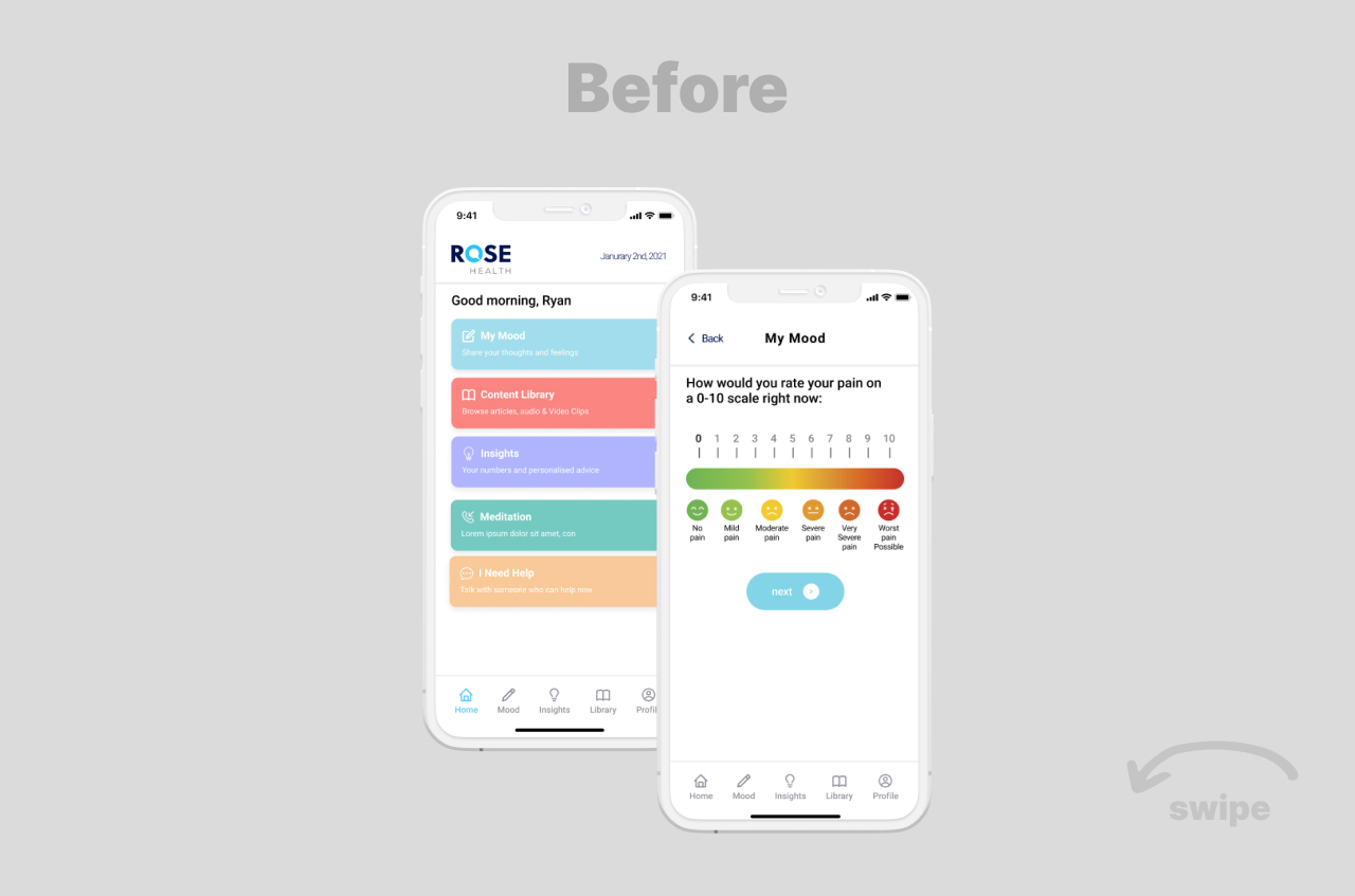
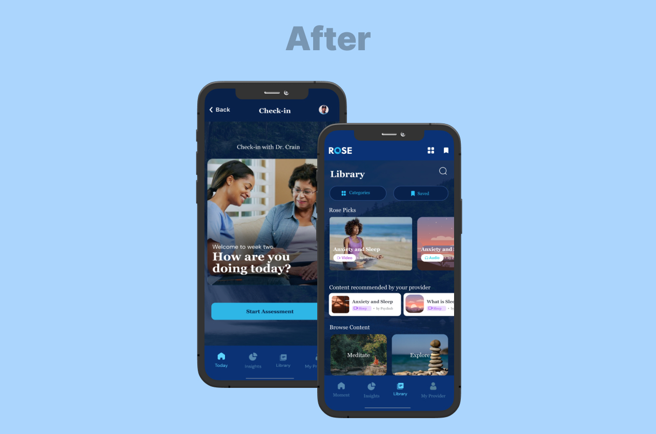
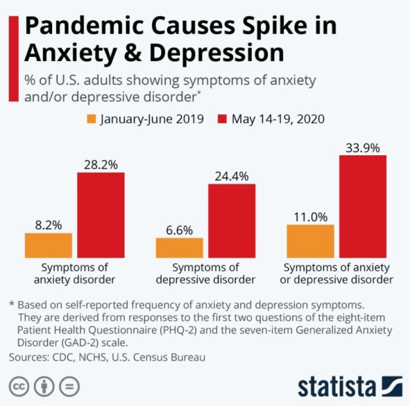
When I joined Rose Health in 2021, the product was a promising MVP with a serious problem. Completion rates on core clinical assessments had dropped from 80–90% before the pandemic to as low as 20% in some user segments. My mandate as founding designer was broad: redesign the mobile experience, build a design system from scratch, and design the surfaces that let clinicians engage patients between visits.
Over the next two years I designed six product surfaces from zero, plus the design system underneath them. Clinical direction came from Rose's Chief Medical Officer, an Associate Professor at Johns Hopkins School of Medicine.
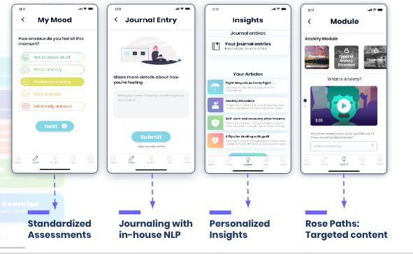
Rose was one of the earliest AI-native mental-health platforms, running seven ML algorithms including natural-language parsing of journal entries. My job was to turn those outputs into something clinicians could trust and patients could act on.
The constraints shaped the work: pandemic-era urgency, a design function of one, and HIPAA and clinical review gating every release.
The system problem...
Rose wasn't just competing with other wellness apps. It was built against a structural failure in how mental healthcare reaches people:
- 85% of mental health concerns are handled by primary care physicians, clinicians who are overworked, under-resourced, and given minutes per patient
- Mental-health hospitalizations among people under 19 rose 61% between 2016 and 2021
- Care happens episodically, an appointment every few weeks or months, while patients deteriorate in the gaps between visits
Remote monitoring was the answer Rose bet on: catch the decline between appointments, route the patient to the right level of care before the emergency. Every design decision in this case study serves that bet.

COVID made it worse. Engagement on Rose kept sliding, and the Mixpanel data made the scale of the problem clear within weeks.
Project goals
- Improve completion and engagement on core clinical assessments, reversing the pandemic-driven drop-off.
- Design a scalable design system to replace inconsistent, ad-hoc UI patterns across the app.
- Build age-appropriate experiences for a diverse user base spanning kids, teens, adults, and clinicians.
Scope: what I owned
As founding designer, I built and shipped:
- Adult patient mobile app Clinical assessments, mood tracking, journaling, content library, care team messaging.
- Adolescent mobile app A separate product for kids and teens, with age-appropriate interaction patterns.
- Clinician dashboard Real-time patient monitoring, risk surfacing, appointment scheduling.
- Admin dashboard Practice management, billing, patient roster.
- Employer dashboard Population-level insights for enterprise clients.
- Parent/teacher caregiver portal Where caregivers complete their side of clinical assessments and follow progress.
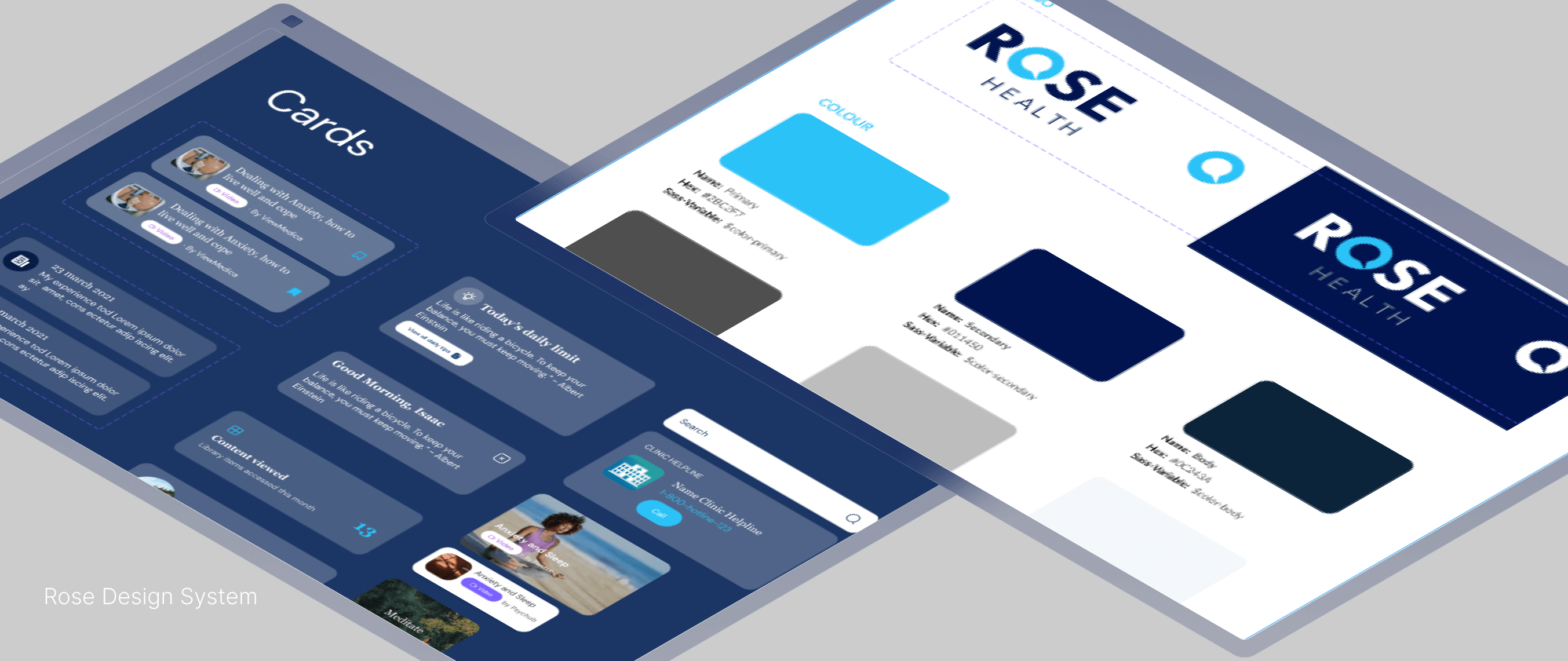
- The design system that unified all of them A component library, tokens, and visual language, shipped from zero.
One platform, three audiences...
The six surfaces existed to serve three very different users, and each design carried a clinical-economic job, not just a UX job:
-
For patients
Daily check-ins, journaling, mood tracking, and the content library. The job: make engagement effortless enough that the monitoring data actually exists. No data, no early detection.
-
For clinicians
Flag queues, triage views, and assessment review on the dashboard. The job: compress a patient's weeks of signals into a decision the clinician can make in minutes, and escalate or de-escalate care to the right level at the right time, which is where the savings in value-based care actually come from.
-
For caregivers
The parent/teacher portal, where caregivers complete their side of clinical assessments and follow progress without invading the adolescent's private space. The job: complete the clinical picture without breaking the trust that keeps a teenager using the app at all.
Designing under clinical constraint
Rose was HIPAA-compliant, integrated with electronic health records and backed by a licensed clinician network. Every design decision sat inside that envelope.
The most consequential work was the flows for the worst moments. Rose's assessments included the PHQ-9, and question 9 screens for suicidal ideation. A positive screen triggered a crisis flow I designed with the clinical team: an in-app prompt routing to 911 or Rose's care team, backed by 24/7 therapists who could answer within 30 seconds.
The hard part was urgency without panic. Act decisively, but don't frighten someone into closing the app, which drops them out of monitoring exactly when it matters.
The same model drove green / yellow / red triage: self-care for green, virtual monitoring for yellow, specialist care for red. I designed how that surfaced for patients, as encouragement and a next step, and for clinicians, as flag queues.
The rest sat in the same envelope:
- The GAD-7 anxiety screener and its escalation logic
- Consent language, so patients understood what was collected, why, and who could see it
- The AI outputs, the "Rose Score" and NLP signals from journal entries, which had to surface uncertainty without eroding trust
I also led design on the product for older adults, covering early detection of depression, anxiety, trauma, insomnia, cognitive decay and social isolation. It contributed to Rose's selection into the AARP AgeTech Collaborative™.
The principle underneath all of it, and one I've carried into every clinical product since: screening and triage, not diagnosis. Evidence, not overclaims. The AI flags; the clinician decides. The UI says exactly what the system knows, and nothing more.
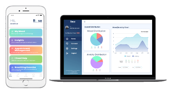
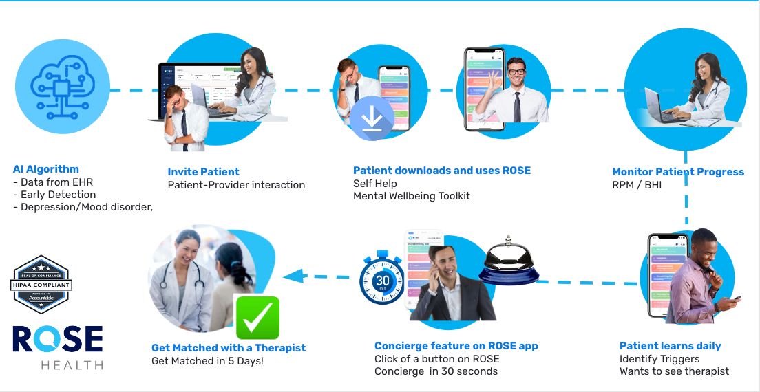
ROSE journey begins with the Primary Care Clinician and supports the patient experience from end-to-end with a superb user experience and easy to implement clinical workflow. Clinicians get reimbursed for the mental health services they provide; the Rose mobile app provides self-help and coping mechanisms; and can call Rose’s Care Concierge Team for an assessment and to get an appointment with a therapist.
Why we did this...
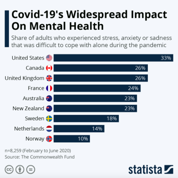
The drop-off had consequences beyond the metric. People with existing mental health problems saw symptoms worsen, and people who had reported none before the pandemic began experiencing sleep deprivation, stress, anxiety, depression and fatigue.
Mixpanel showed it clearly.
Some key insights...
The completion rate for Youth Outcome Questionnaire (YOQ) was far below expectations. For context, the Y-OQ is a parent report measure of treatment progress for children and adolescents (ages 4 – 17) receiving mental health interventions. Here are some key insights below
-
Broken flows and poor navigation
The MVP had haphazard flows across features. Tasks took too long, clinicians could not use several key features without support, and the product was hard to get around.
-
Inconsistency across components
Design elements were all over the place, icons especially. There was no organisation and no library housing elements for reference, so the need for a design system was obvious.
-
An unclear marketing website
The customer journey failed at the website. It took real effort to grasp what Rose was about, sales and marketing struggled to communicate a clear message, and the result was high drop-off before anyone reached the product.
-
Calm was doing no work
The design was heavy on text, which made it harder for non-English speakers. The progress circles looked good but communicated no progress, so there was a balance to find between a calming interface and one that actually shows data, progress and goals. Background sound was one of the other routes to calm we considered.
Our Desired objectives...
Users, youth and kids, wanted 3 things. These 3 (+1) are our pillars going forward.
-
Expectation-setting
Kids especially had little patience and very low attention span. Users want to quickly understand what they're supposed to do. We respect their time by providing direction to what is most valuable for them.
-
Motivation
Users want to be aware of where they are in their journey, and they want to see their progress. Therefore, data we share (and where) matters.
-
Feeling and accessibility
Users want to feel calm, relaxed, and refreshed just by opening the app. There are two points to accessibility: (1) app standards for accessibility (fonts, contrast and so on) and (2) cross-cultural accessibility.
I spent a little more than a week reviewing every individual flow and touch-point across the app and laid them out on Google Sheets for effective collaboration. I scheduled multiple design sessions.
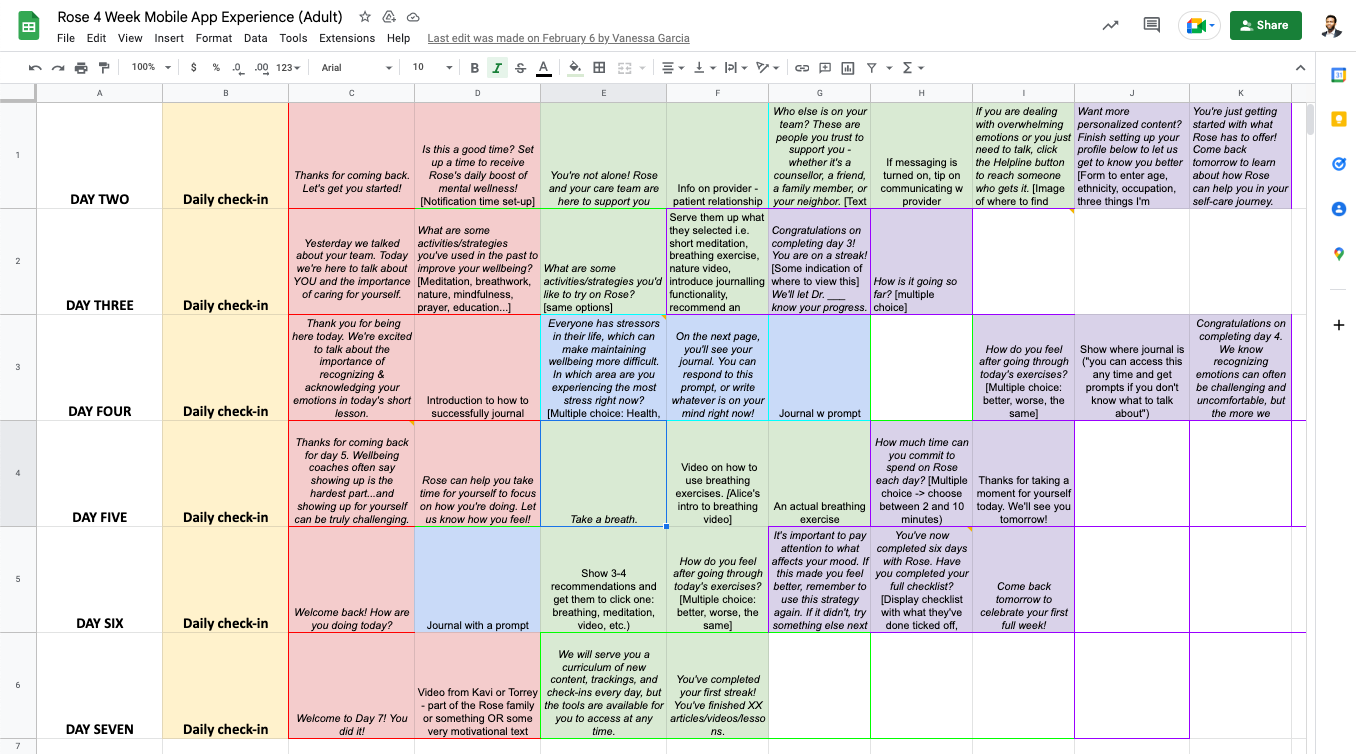
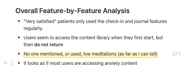
Feature-by-Feature Audit: What did we have?
After gaining clarity and refactoring the existing flows and customer journey, I adopted Notion as a documentation tool. It was very effective in complex mapping and team management - prioritizing tasks and making rough estimates to manage stakeholders.
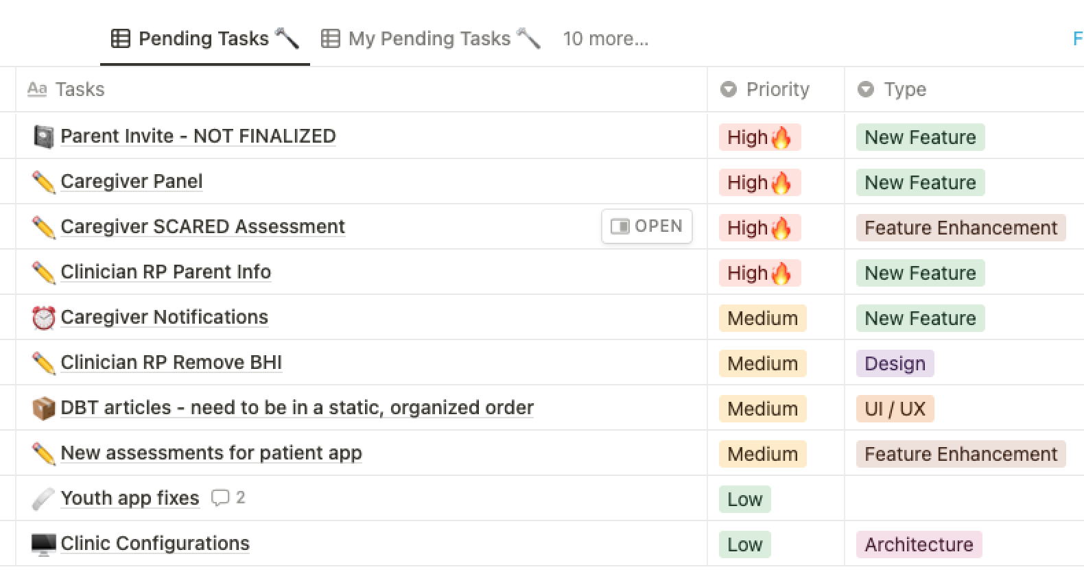
Understanding kids better...

The diversity of the user group was a big challenge. The app had to be equally fun and usable for kids between 8 and 16 years of age, for kids with different mental health conditions, care-givers and for parents. I conducted focus groups and interviews to gain valuable insights into the users’ needs and expectations regarding the app. Here are some Questionnaire to the build up
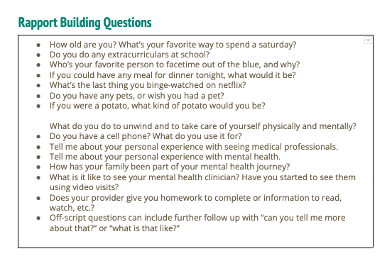
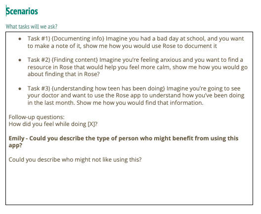
From the research“Well... my bestie and I kinda prefer to chat on Snapchat because my mom wont get to see our secret messages any time she snoops around my phone at night..”
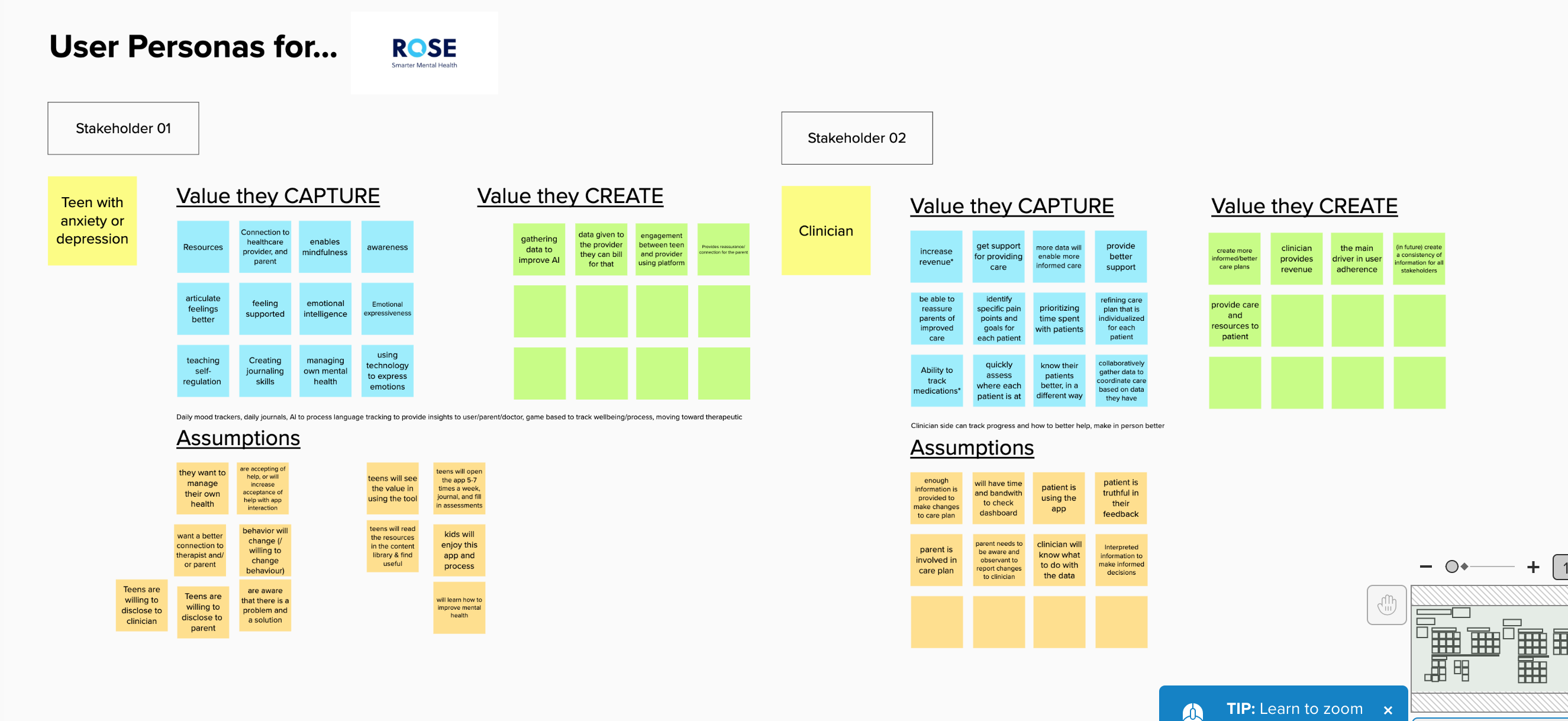
Based on the user research, we worked out user personas for the different user groups on Mural app. During a status quo session, we presented the insights and conclusions from the research to the larger team. At the end of the meeting, all team members knew who they were designing the app for and what features these users requested.
Mapping journeys....
While we know we “broke the rules” and even caused some heated debates on the ‘correct’ way of doing things, I truly believe we did the right thing. We broke the rules based on our research of what was important to our users. We got consistent, insightful and valid results because of it, and it would have been impossible to find these insights using a traditional card sorting method.
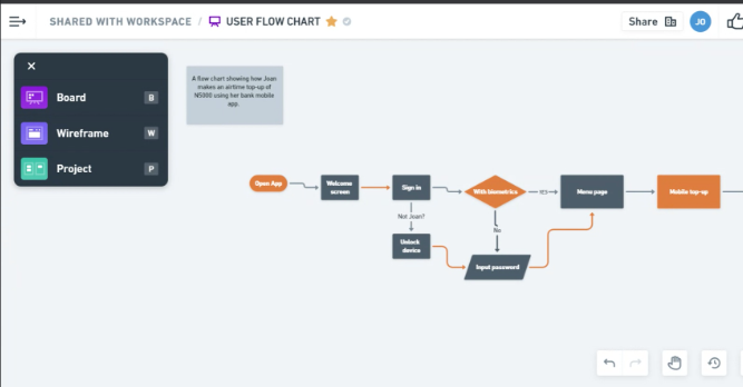
I conceived 3 major user flows that would entail the most vital routes that the kids to accomplish key tasks on the application - especially the messaging feature.
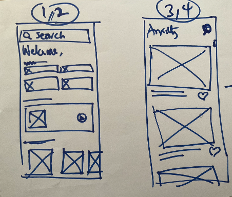
This concluded the entire research stage that was basically the very core of the new direction. We understood who ways to enhance user experience and what they needed and wanted and also explored the business goals and how the product can help to satisfy both the users and the company. Based on that evaluation, the complete architecture and wireframes were re-created. At this point, I started working with User Interface designs. I focused on the functionality of the application, navigation and the interaction of screens with each other. Moreover, this stage and the simplicity of the target goals helped me quickly test my ideas without going into details.
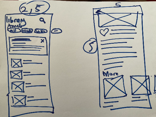
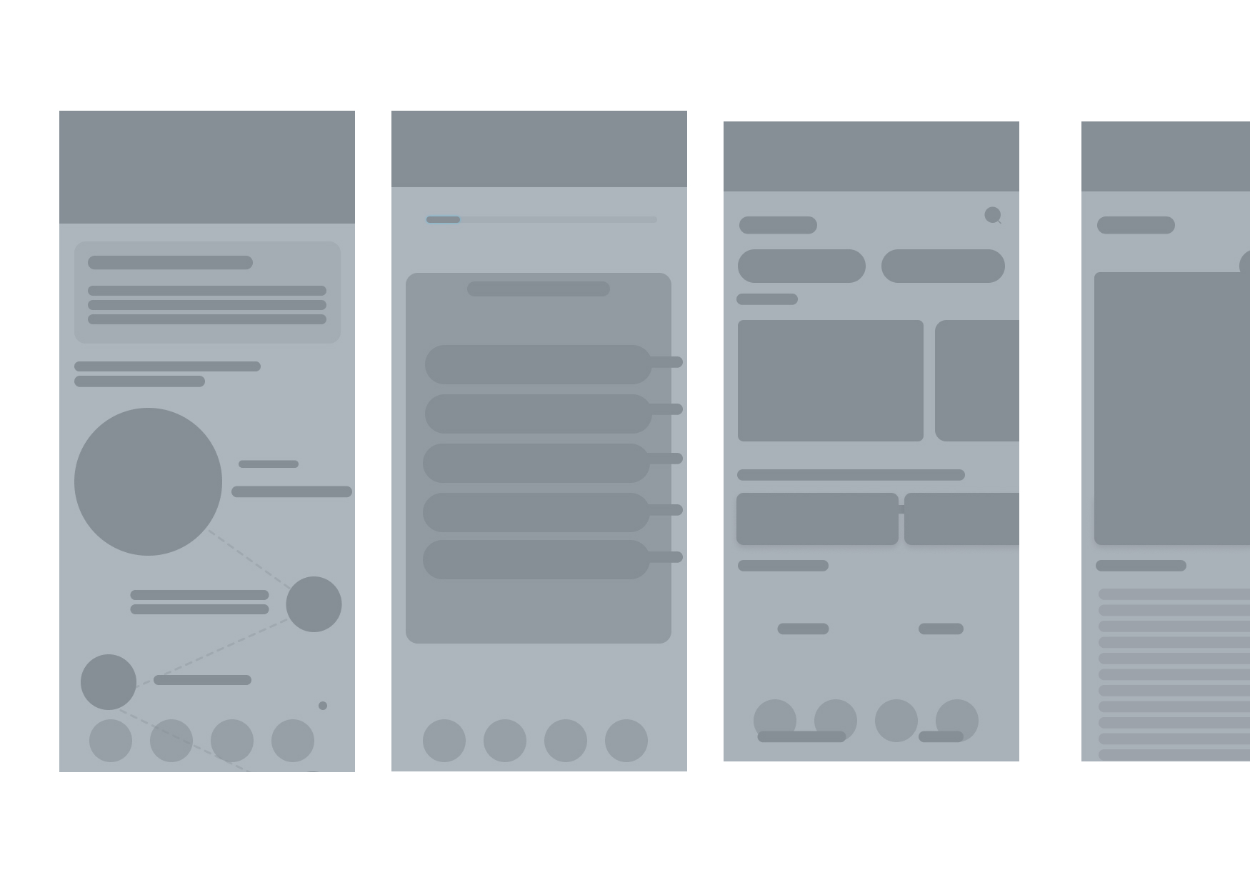
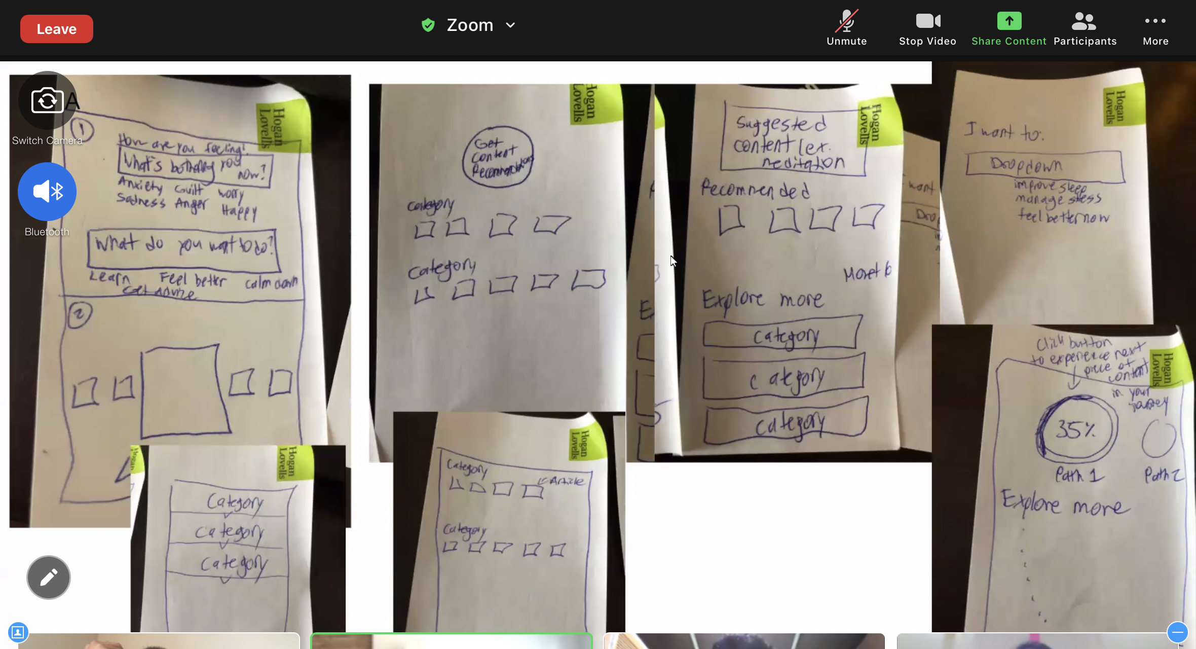
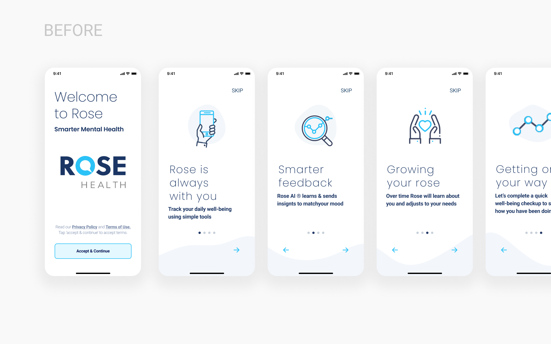
When it came to the design of the new ROSE app, the biggest challenge was to step outside of the boring, gray design into something more appealing and exciting for kids without going away from the brand. A colorful and fresh solution could provide a clear difference by becoming emotionally engaging.
Outcomes..
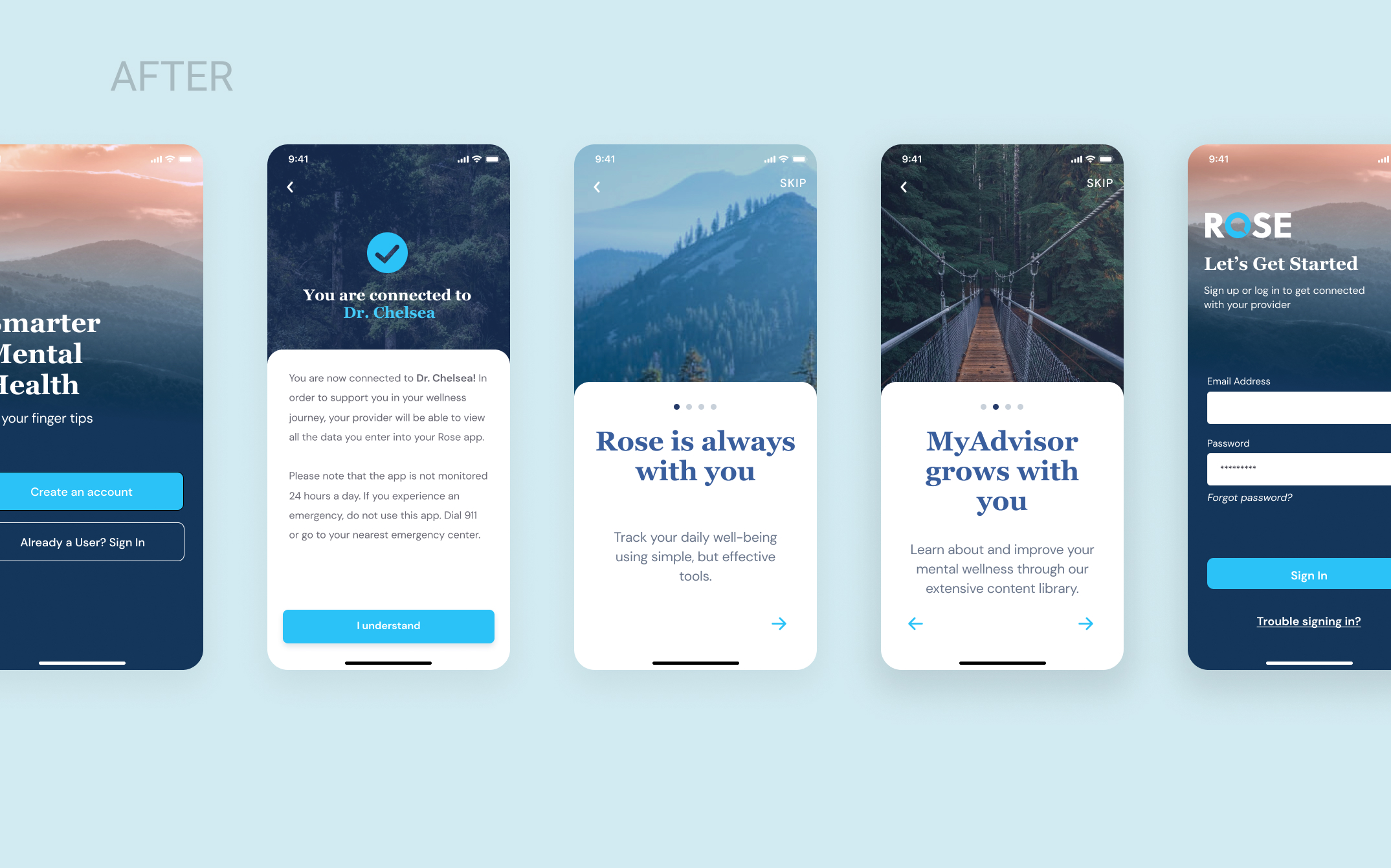
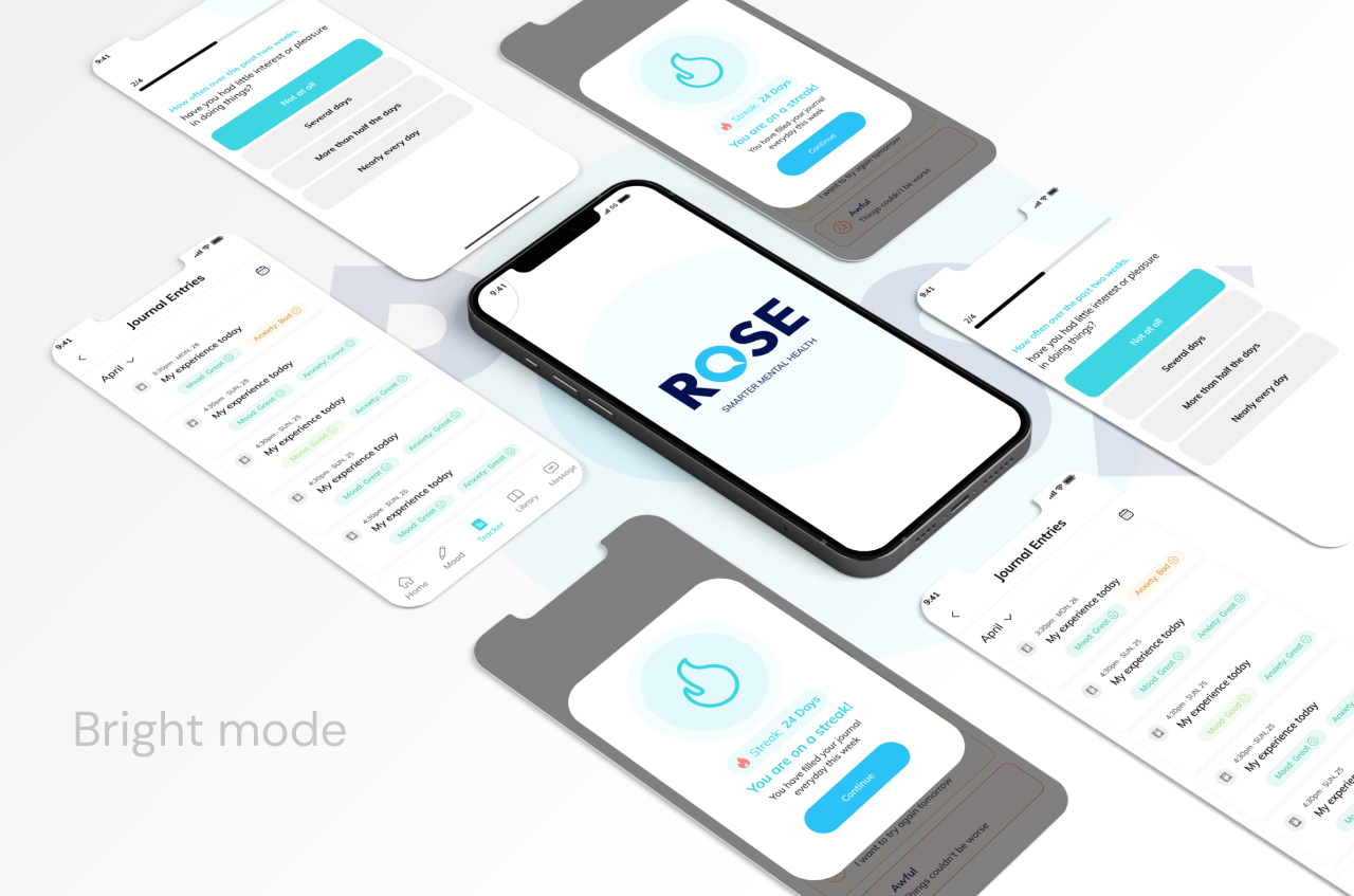
One highlight was that we focused carefully on the sign up/login screen, as that’s the first thing welcoming a user without friction. We wanted to provide an inspiring, calming and focused tone for the day ahead.
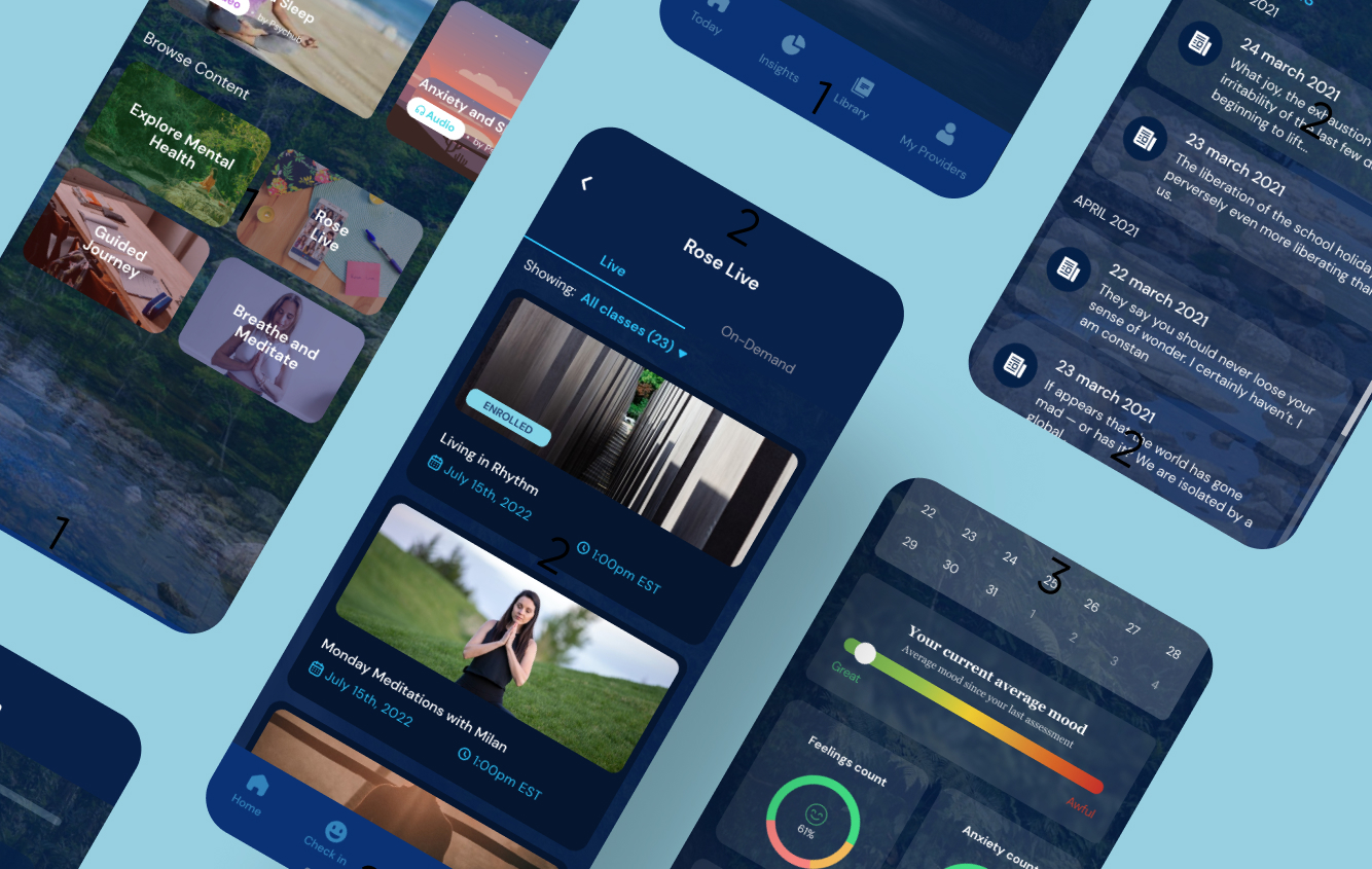
In the background, we have displayed a picture of mountains, which provides a relaxing appearance while keeping users calm. Mountains and waterfalls bring a feeling of open space and freedom, which is was sorely missing in the MVP version. We wanted to bring joy to users’ daily lives, so we made personalization available, providing an option to change the background picture.
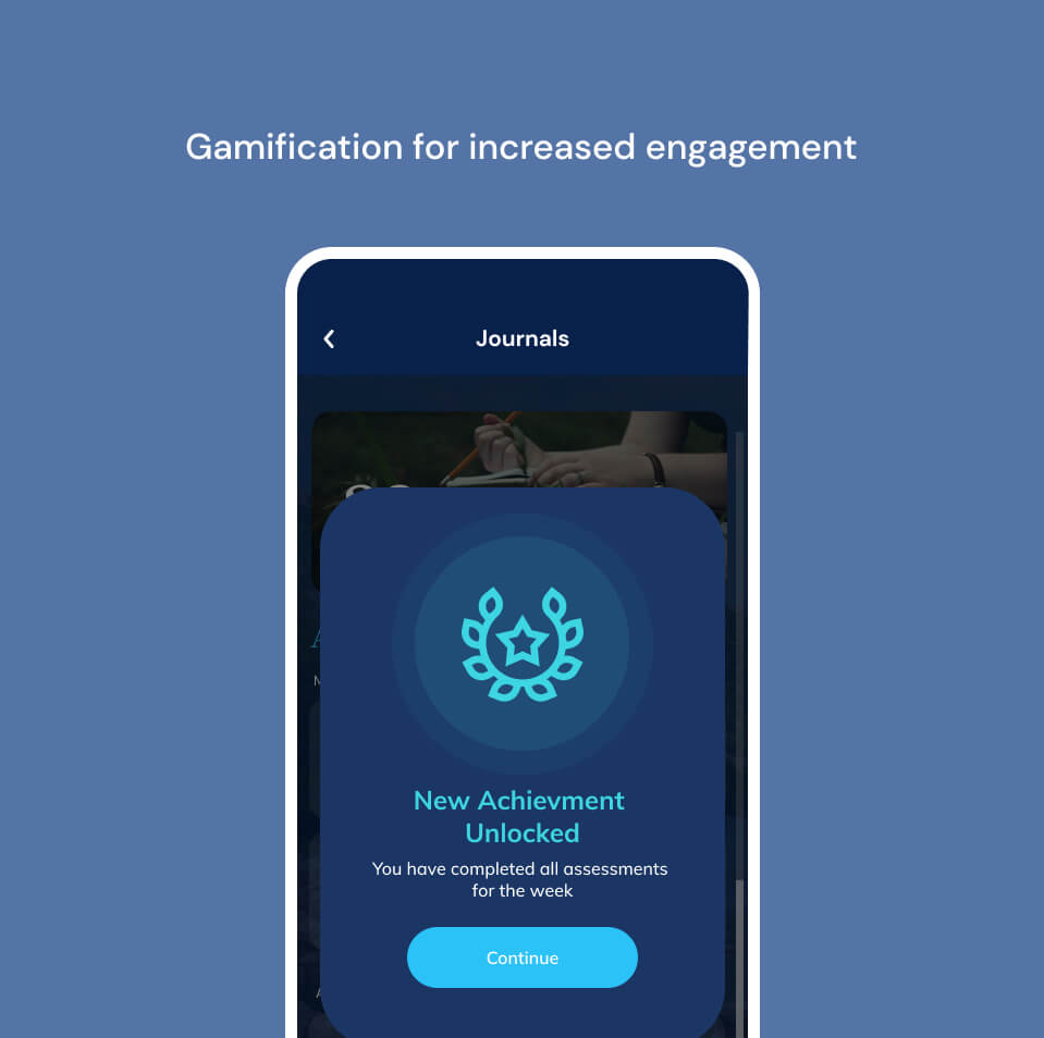
We used gaming reward-like elements to inspire users to reach their goals while, at the same time, keeping them informed about the progress they were making. Thus, we are using digital technologies to help kids reach their goals in the most engaging way.
Kids loved short TikTok-like interactive content
A redesigned content library. We introduced TikTok like short videos that kids love! They are easy to watch and dont feel like a chore!
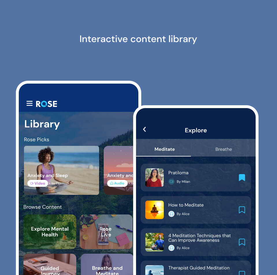
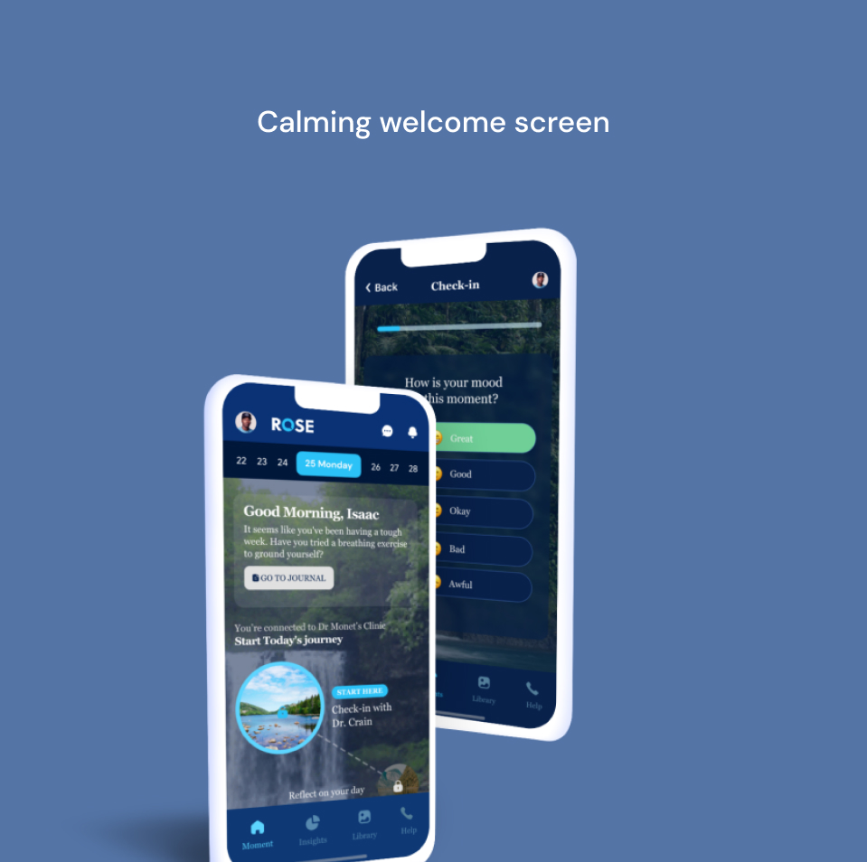
Guided and unguided meditations that focus on relaxing in general and keeping steady in tough times
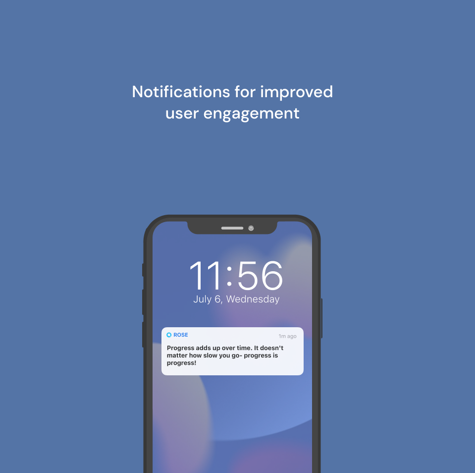
Don’t forget to turn on your notifications. Rose will send you a daily boost of motivation, and a reminder to complete your check-in for your doctor.
Some thoughts after AB testing...
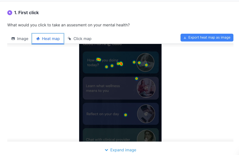
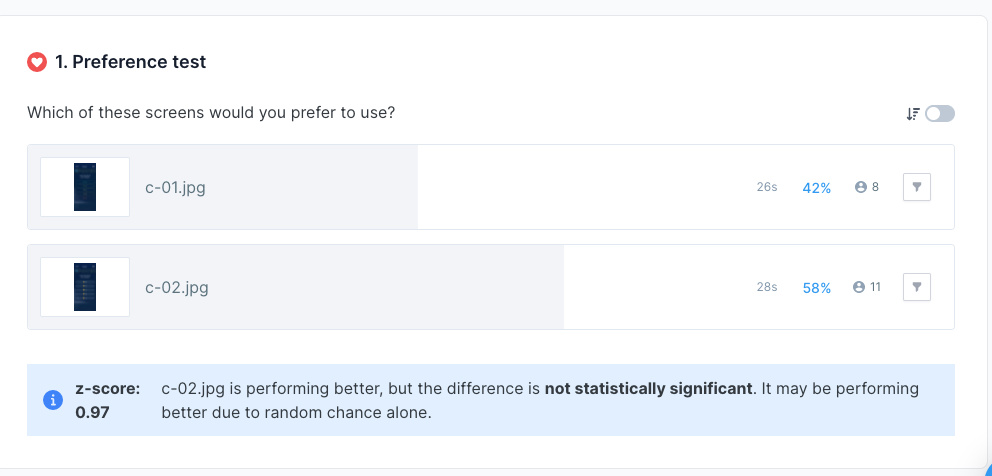
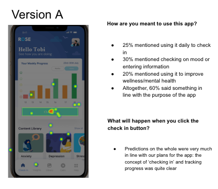
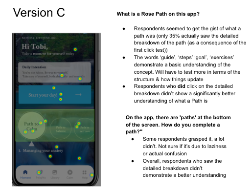
I conducted 2 rounds of moderated usability tests with over 15 users in each round. This was to identify any usability or navigational issues that may arise and to get feedback on the visual aesthetic of the product. After creating wireframes and choosing a style, we started to do the final design. We made a prototype of the project and asked participants to do tasks in order to test it with them. We picked realistic scenarios to engage the participants in reaching their goals with the app. Then we conducted the desirability test to understand users’ attitudes, and the navigation test to see how the users understood the navigation. After that, we ran a user test to get overall feedback on Usabilityhub.com
The results
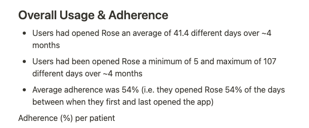
The results were almost instant. Adoption increased amongst new users, and over the span of two months, daily active users increased significantly. Zooming out further: the platform sustained 54% average adherence over four months. Users opened Rose on more than half the days between their first and last session, in a category where sustained engagement above 10% is exceptional.
- 54% average adherence across 4 months
- 100% of head-to-head preference tests won by the new direction
- JMIR peer-reviewed publication of the platform's adherence research
Where it stands today
In October 2022, Rose Health was acquired by Precise Behavioral. The product didn't just survive the acquisition. It became Precise Digital, the technology arm of the combined company, deployed today across U.S. health systems, ACOs, skilled nursing facilities, government agencies, and correctional institutions.
Rose also joined the AWS Healthcare Accelerator after the acquisition.
Three years after I moved on, the work still ships. The onboarding, the crisis flows, the component library, all of it, still in production. That's the outcome I'm proudest of. Not the launch metrics from any one quarter, but the fact that the work held up.
You can see the current commercial form of the work at precisebehavioral.com/precise-digital.
What this work taught me
Three things stuck with me.
-
A design system is a business asset
Not a design convenience. It outlives the company that made it.
-
Clinical constraints are creative constraints
Working inside HIPAA review and clinical sign-off made the design more specific, not less.
-
Safety-critical flows are the real test
They are where product design proves whether it can hold real weight.
Thanks for reading. If you want the next chapter, I'm applying the same thinking at Hibiscus Health, where I lead design for a Johns Hopkins validated cardiometabolic AI screening platform.