Case study / 2023 / Lead Product Designer
RevatsDesigning AI job seekers can trust
An AI resume tool shipped in the first year of the LLM era. One less thing to worry about during your job search.
My role
Lead Product designer. Product Strategy. User Research. UI Designs.
Interaction Design
Tools
Notion, Figjam, Excalidraw, Google Forms, Google Analytics, Figma.
Usabilityhub
Deliverables
User research, Idea validation, Userflows, UI designs -
Wireframes, High-Fidelity Prototypes
Time / Duration
2023 / 4-6 weeks
Visit Link
revats.ai
Some background...
This product was inspired, sadly, by the recurring tech layoffs in 2023 and also by OpenAI's groundbreaking models. A record number of job seekers were in the market in applying to jobs. On this project, I got to consult for a diverse remote team spread across Berlin, Zurich, and Toronto - bringing together expertise in AI engineering and recruitment industry. This design project remains a favorite because it reminded me that design, in practice, is NEVER TRULY A LINEAR PROCESS

2023 was a nightmare for job seekers
And so, I brought into this, my previous experience designing multiple iterations of job portals/dashboards during my time at TalentUp Africa. I also got to apply my knowledge of the job-seeker psychology, how Resume Parsers work and the role ATS(Applicant Tracking Systems) play.
The problem
Some preliminary research showed that most job seekers often get overwhelmed with constantly tweaking and updating their resume to fit requirements of every job application. And despite their best efforts, MANY still struggle to secure interviews and suspect that their resumes are not effectively showcasing their skills and experiences. While this started as a plausible hypothesis, I stayed open-minded to other ideas that may challenge this problem statement.
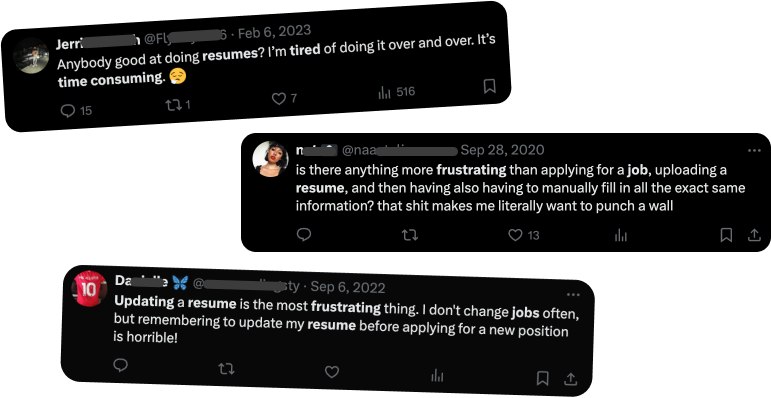
- 72% of job seekers find updating their resume time-consuming TopResume
- 26% customise their resume for each application CareerBuilder
- 76% of applications are rejected by applicant tracking systems Forbes
Opportunity
Recognizing this job search/resume problem, my team and I identified an opportunity to leverage OpenAI's recent groundbreaking models to streamline and simplify the process of resume optimization. The name "Revats" was thus coined from "REVerse - ATS" (my idea).
Again, my role as the designer was to bring this vision alive - from being just "a simple idea" to becoming interactive prototypes for validation and user/business success.
Goals
Despite living in different cities of the world, we were united by a common goal:
Ease and quicken resume optimization to empower job seekers
Ship a working MVP ahead of the Antler application.
Antler's
Fall 2023 cohort was the funding target, typically $100,000 to $190,000 for 10 to 12% equity, so a
working product before September was the business constraint everything else lived inside.
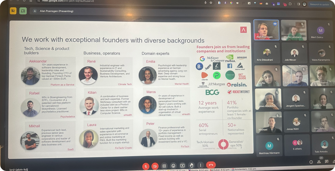
One of Antler's Orientation for its next Cohort
Design an experience that converts skeptics.
Job seekers had
already been burned by clunky AI resume tools. The design had to earn trust fast enough that a
first-time visitor uploads their resume, and enough of them convert to paid.
Key stakeholders
A closely-knit team living in different time zones. These were the key members I interacted with on Slack, Google meets and several calls - 1 founder, 2 co-founders, 1 Product Owner, 1 Product manager, 2 AI engineers, 2 frontend developers and 1 backend developer.
Some early struggles
Not unique to this product/project, here were some challenges from the very start -
Aligning strong perspectives:
With founders, PMs, and AI engineers each holding a distinct vision for the product, early alignment was
the real challenge. I ran HMW and brainstorming workshops to surface every perspective openly and
converge the team on shared project goals.
Recruiting users for UX research was tough. Asking them to share resumes or asking for personal experiences was difficult due to privacy concerns. Building trust and highlighting research benefits was essential. I also leveraged my social media network (LinkedIn and Instagram) for polls
Technical Proficiency Issues:
Varying technical skills among
target users complicated early feedback sessions that I tried to organize. I spent more time than i
hoped on video calls and follow up interviews.
Nevertheless, I was able navigate these early headaches well enough to continue with the design process
Solving the problems
The Agile way
With the nature of the constraints, I recommended we adopt an agile approach. Together with Taiwo Adedotun, our PM, we defined clear user stories and product goals based on research insights and user personas. I created the design strategy plan and then facilitated several workshops with my team. Here are some highlights on how it went
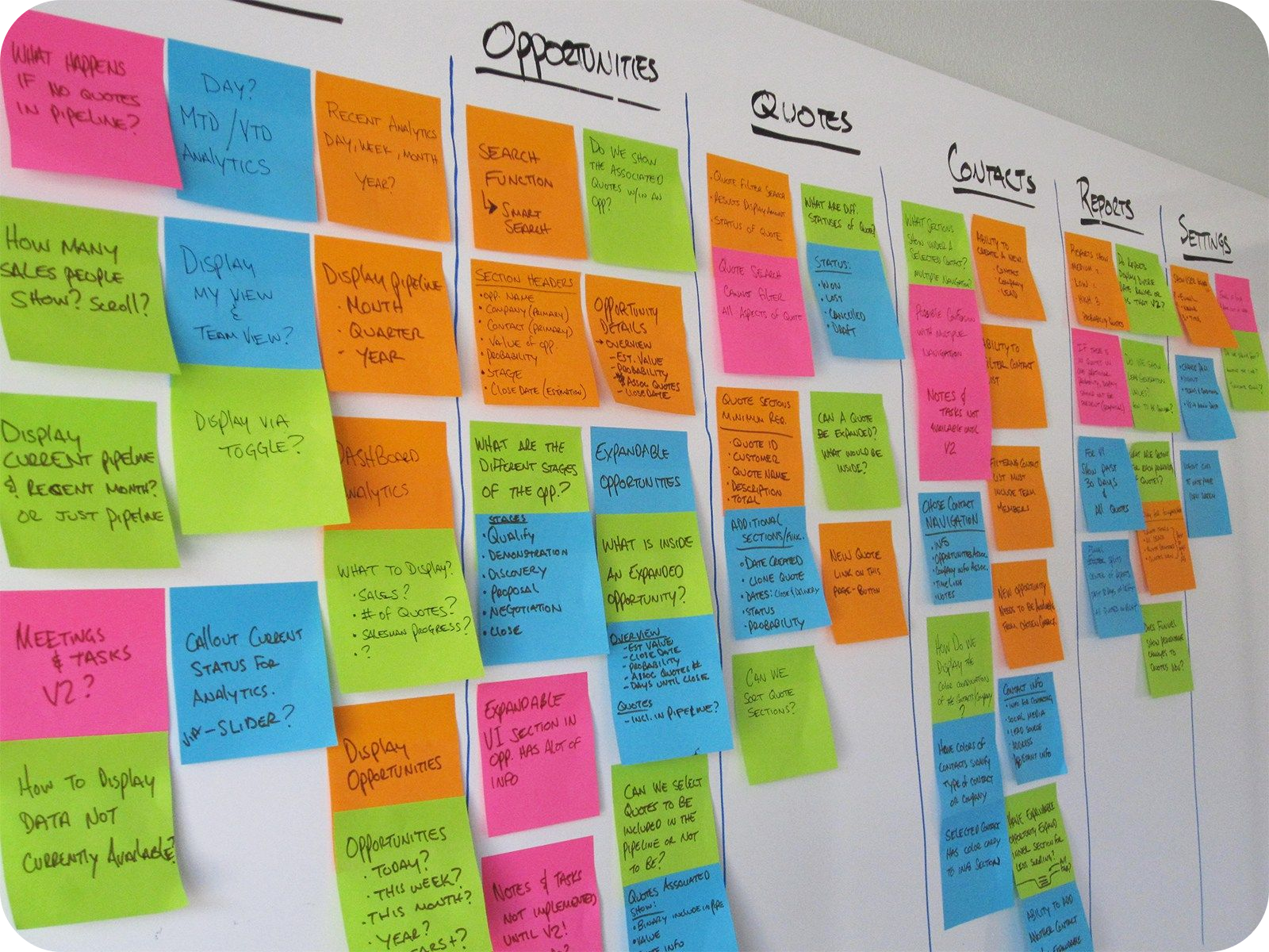
card sorting during User research
Deciding Research Methods
Design is hardly ever linear. In response to the challenges posed by a remote working environment, I adopted virtual user interviews, online questionnaire surveys, and virtual stakeholder workshops to gather insight.
In addition, social media was such an invaluable asset in connecting users. Mutual friends on Twitter and Linkedin were very eager to help complete the research. Virtual interviews on Google meet also allowed for in-depth qualitative data collection from job seekers across different parts of the world, while online surveys provided quantitative validation and scalability.
identifying Users
Understanding job-seekers and validating pain points
From the survey and interviews results that took a little over a week and over 400 responses via google forms, I drew out 4 core personas to provide a deeper understanding of the frustrations, goals, personality traits, and concerns of individuals navigating the challenges of resume formatting and updating during their job search, backed by quantitative data.
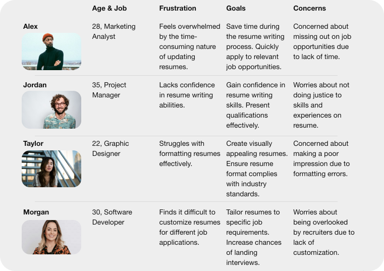
Selected Personas and their Painpoints
For instance, "Tina's" frustration with using similar tools she discovered online became evident as she recounted her negative experiences while using them. She had tried various resume optimization platforms in the past, only to feel overwhelmed by the sheer volume of suggestions they provided and poor UI.
Some Insights
My findings helped provide some insights that would answer some key questions:
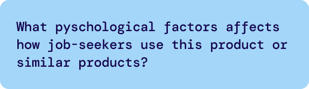
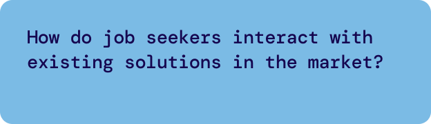
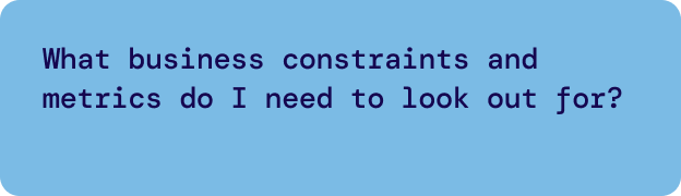
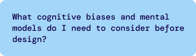
Competitive Analysis
Standing out from others
After listening to these insights, I put together a few apps that topped the list - Resume.io, Enhancv, Rezi, and Jobscan.
Each tool had one clear strength: Enhancv on visual templates, Rezi on AI guidance, Jobscan on ATS matching. None combined all three, and none explained their AI's reasoning to the user. That gap became our positioning.
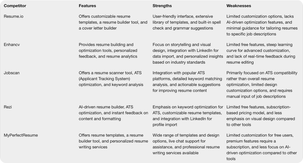
A look at competition
This analysis helped me identify opportunities for differentiation and innovation, ensuring that the design of a new product or service addresses unmet needs and stands out from the competition.
Beating the ATS with UX laws
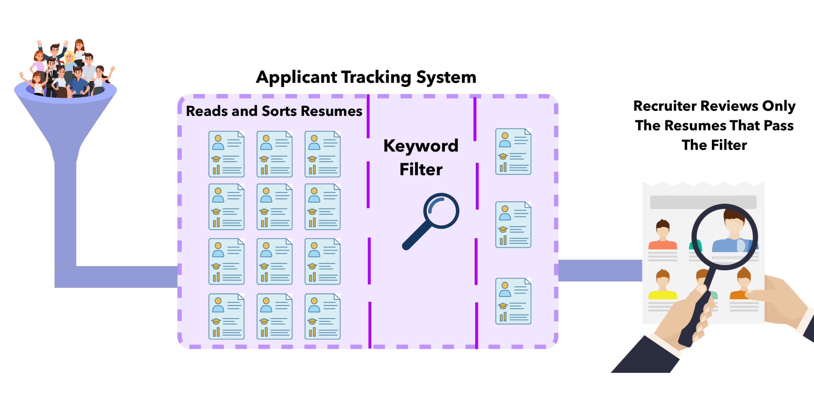
how ATS(applicant tracking system) work
While brainstorming, two design decisions did most of the heavy lifting in making AI feel simple rather than overwhelming:
- One suggestion at a time. Early prototypes dumped every AI recommendation on screen at once, and testers froze. The shipped design ranks suggestions and reveals them progressively, so users make one confident decision at a time instead of triaging a wall of edits.
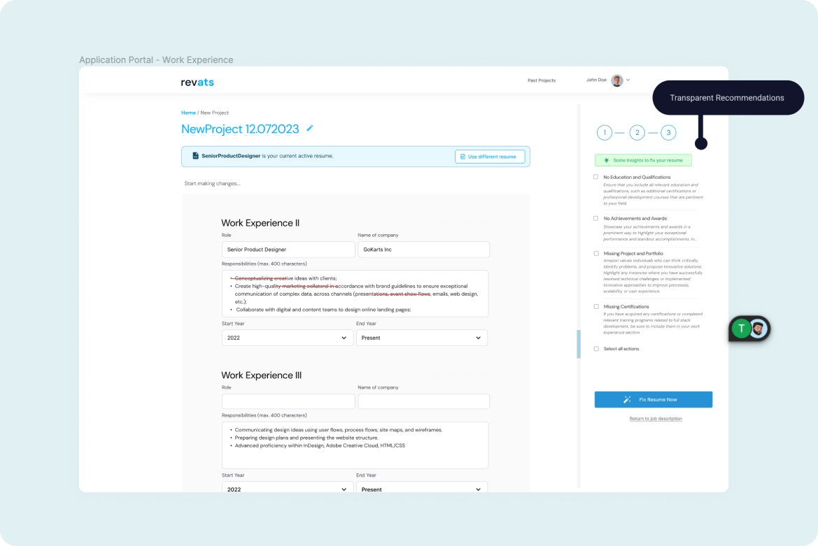
- Every suggestion explains itself. Each AI recommendation carries its own plain-language reason: what it changes and why it improves the resume's chances. Users accept edits they understand and reject ones they can't interrogate.
The supporting craft, generous tap targets, logical grouping of related suggestions, and clear feedback on every action, followed from those two decisions.
Rapid Prototyping - Flowcharts & Wireframes
I employed Figma's templates for wireframing and FigJam for creating flow charts. These tools enabled me to rapidly prototype and iterate on my ideas. Leveraging Figma's collaborative features, I efficiently gathered feedback from stakeholders and iterated on my designs in real-time, ultimately improving the overall user experience.
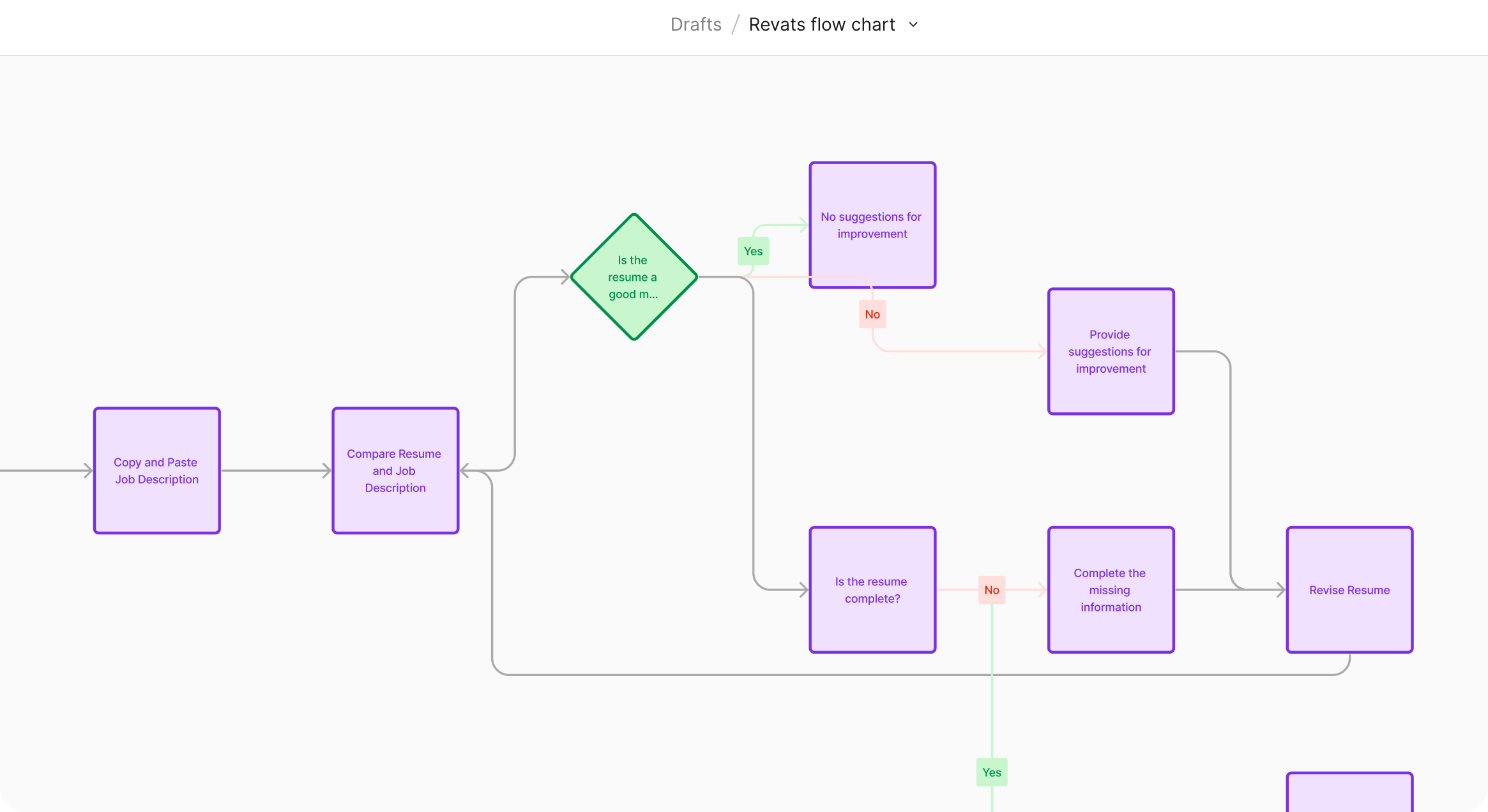
Level-0 flow chart
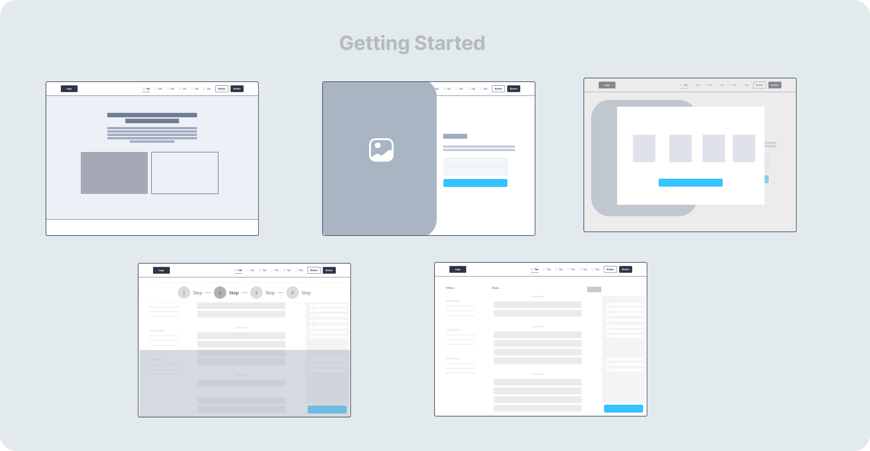
Some Low-level wireframes
Final Results
Introducing Revats
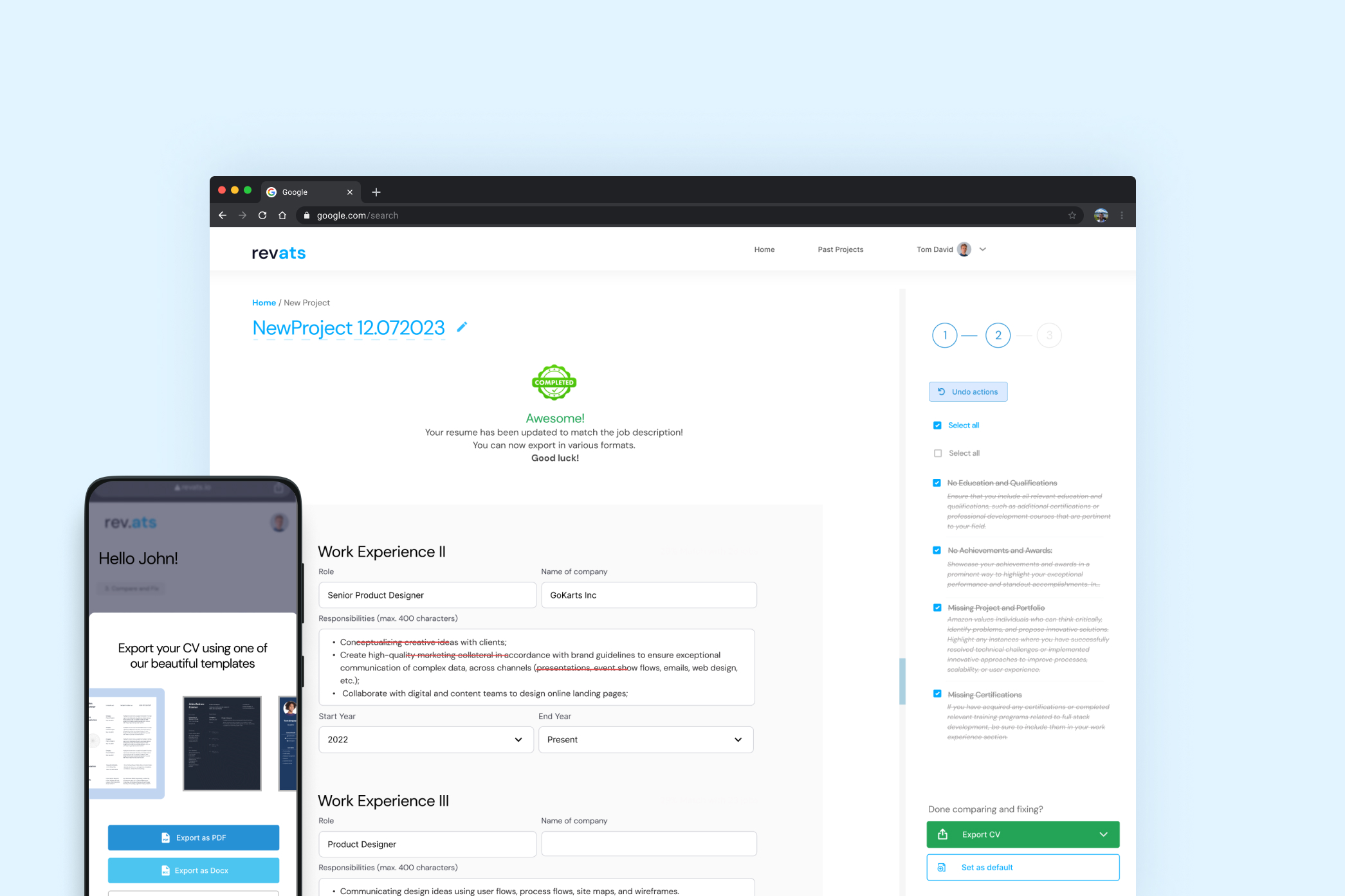
Revats - revats.ai is a tool that allows job applicants to see how well their resume matches a job posting and tailors their resume to each job description for a significantly increased chance of passing through automated screening (through ATS) or screening by a human.
Value-first onboarding
So many apps fail by asking for user sign first. In crafting the onboarding process, I strategically employed Reciprocity Psychology in UX to foster a sense of trust and engagement with job seekers. By offering tangible value upfront, even before reaching the sign-up page, users are more convinced about Revats solving their problems. I have captured this in the clip below-
Onboarding and conversion
Trust and Value before commitment
By showing them only a glimpse of what to expect after parsing their resume, I demonstrated revats' commitment to empowering job seekers and enhancing their journey. During testing, this approach not only captivated users' interest but also laid the foundation for improved conversion.
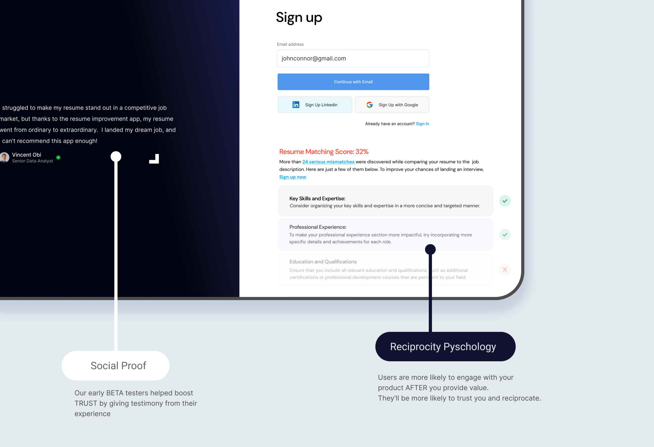
Designing AI people can interrogate
An AI that rewrites your resume is handling your professional identity. Users won't accept an edit they can't interrogate. So every suggestion in Revats is transparent: a clear sidebar with checkboxes explains what each change does and why it's recommended, letting users accept, reject, or modify with full context. In testing, this was the moment skeptical users converted. The reasoning, not the suggestion, is what built trust in the AI over time.
This became a design conviction I've carried into every AI product since. At Hibiscus Health, the same principle governs how clinical AI outputs are surfaced to patients and clinicians.
Flexibility and Diversity
For export, I designed a vertical carousel of resume templates, each one screened for ATS-parseability first and aesthetics second. A beautiful template that a parser can't read would defeat the entire product.
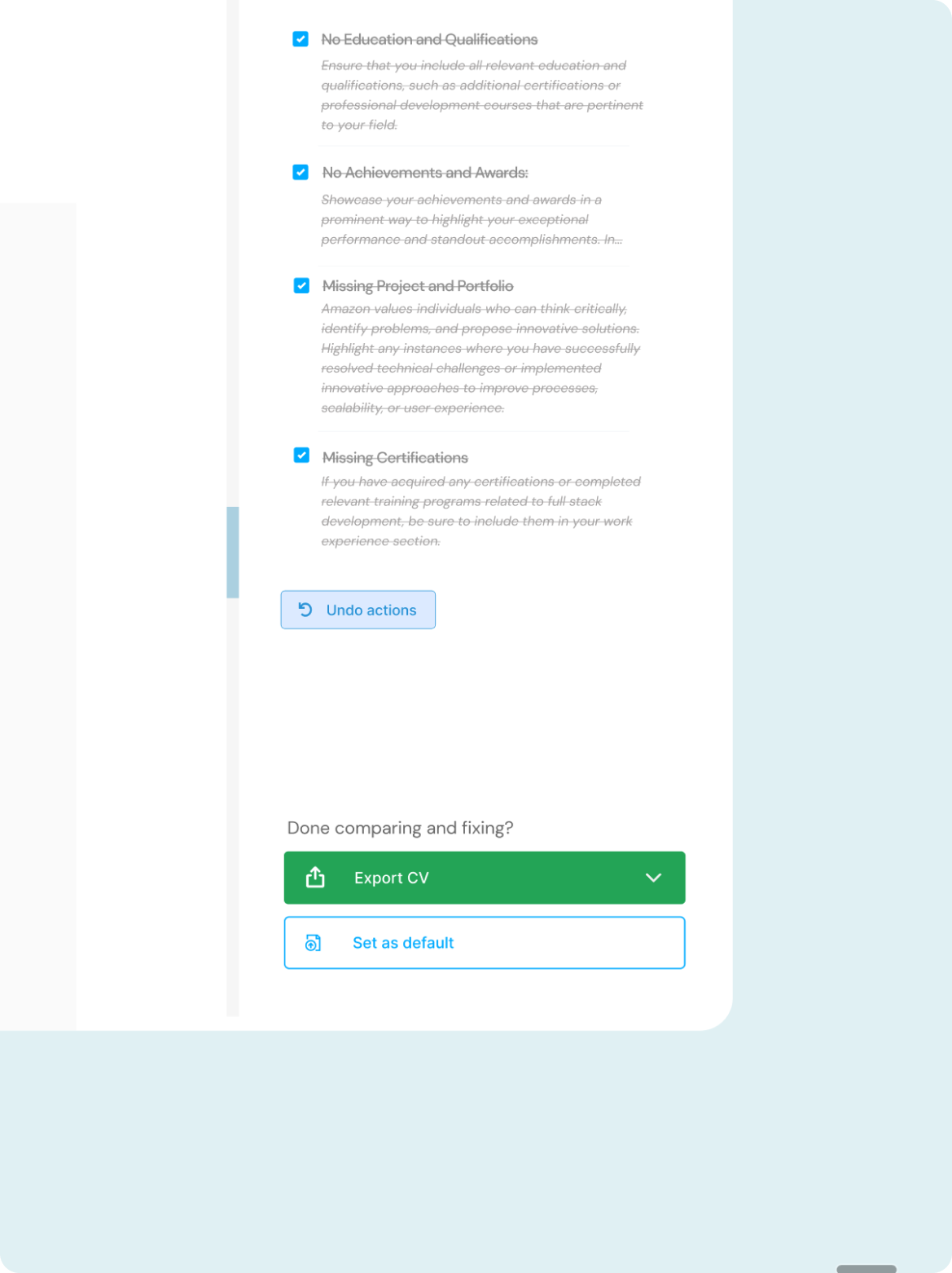
exporting resumes
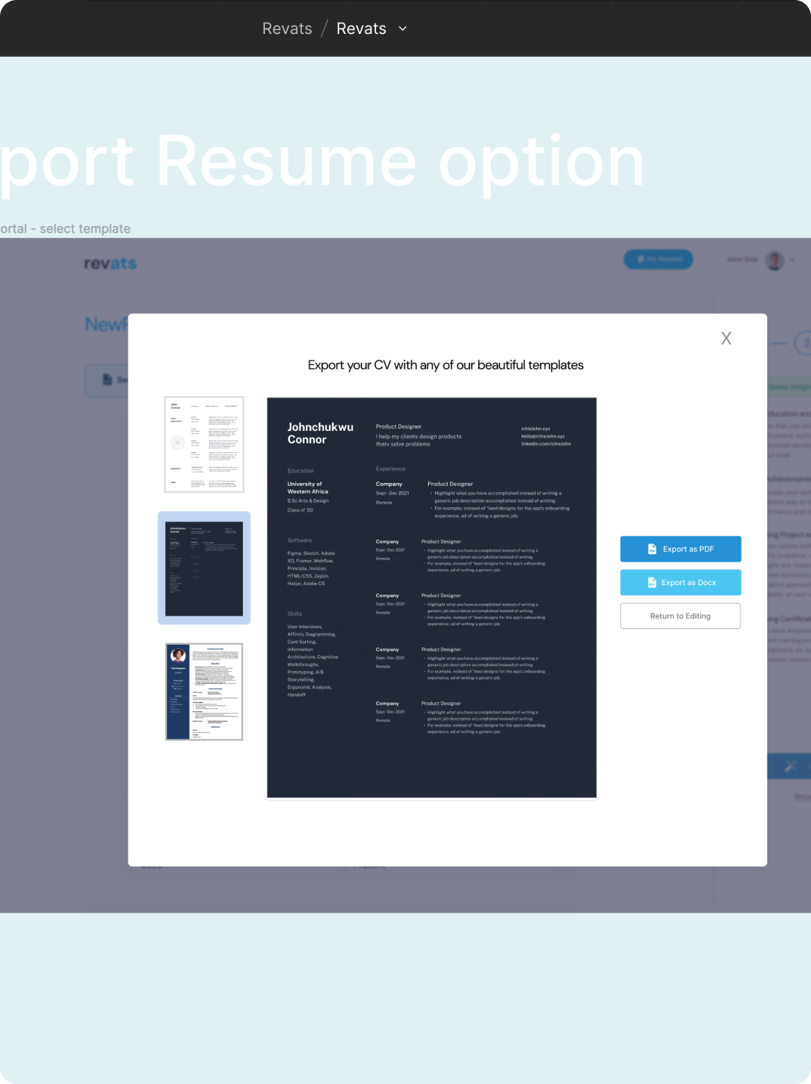
selecting a template
Mobile Responsiveness
Most job seekers check applications from their phone, so the mobile version wasn't an afterthought. Reviewing AI suggestions and exporting a resume both had to work one-handed on a small screen. Usability tests confirmed mobile participants completed the core flow without help.
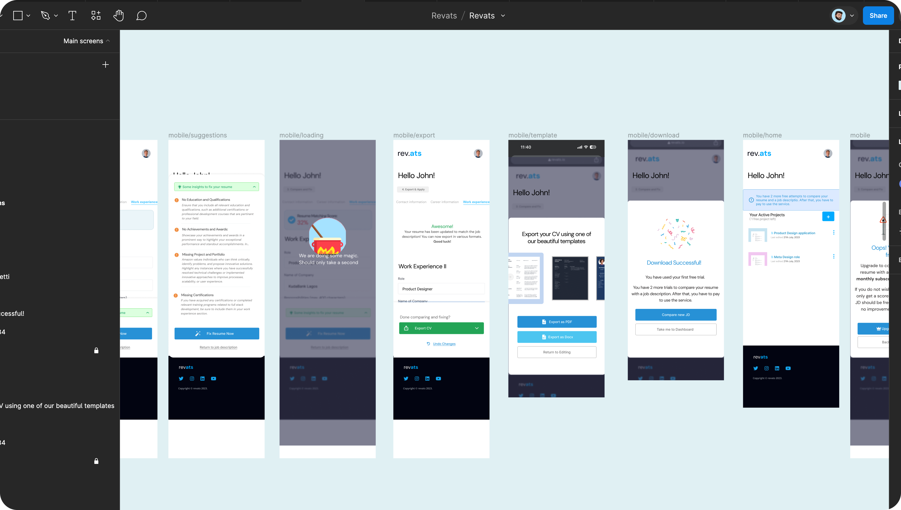
Other screens
Here are a few of the key components of the product that was designed
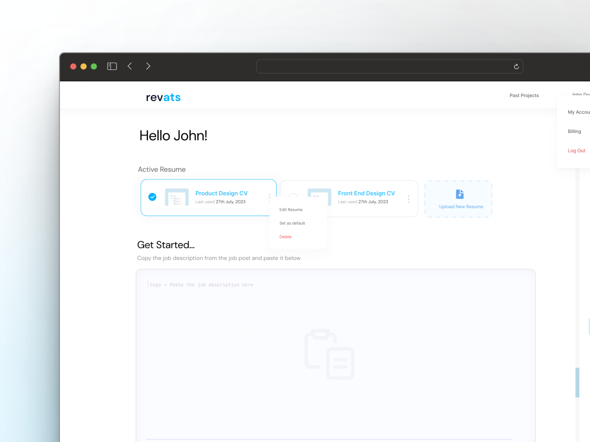
Your Workspace
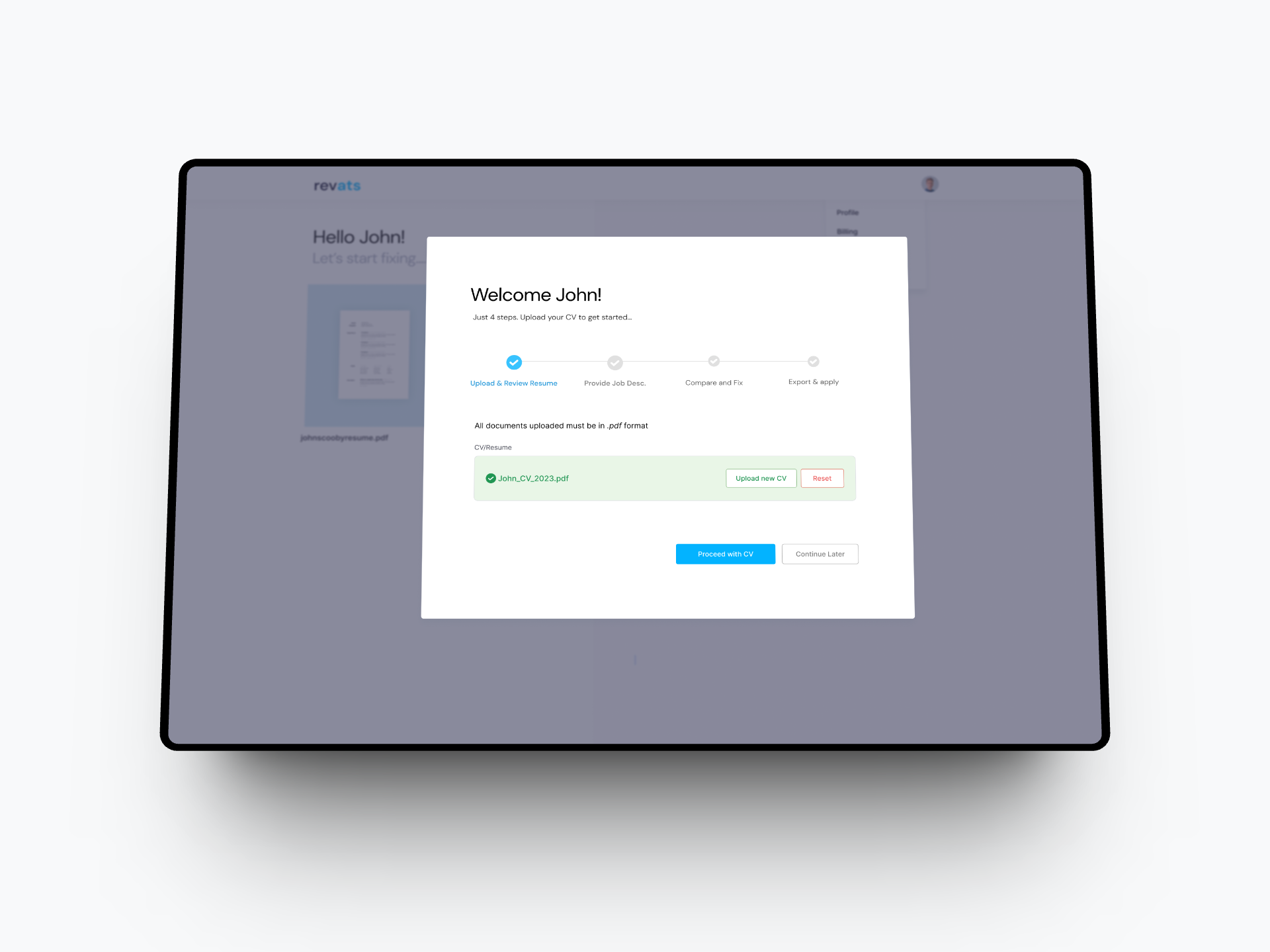
Getting Started
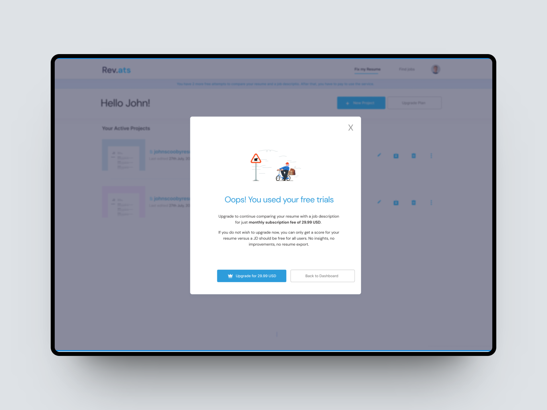
Free trial ends
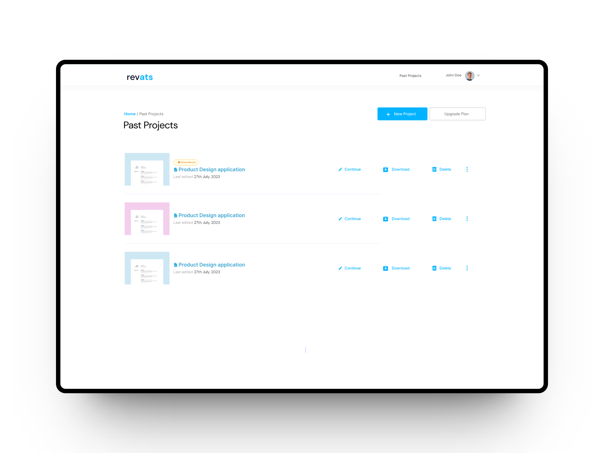
Recent projects
Impact and Outcome
For Job Seekers
-
Active users grew 110%
Across the first weeks of launch, with weekly usability tests driving iteration throughout. In comparative usability sessions, participants reported roughly 30% fewer frustrations with Revats than with the competing tools they had used before.
-
The result I still smile about
Within the first week of the MVP going live, three insurance analysts and one research assistant landed interviews with resumes Revats helped shape.
For the business
-
Shipped for the Antler window
The MVP shipped in time for the Antler application window, the deadline the whole sprint was built around.
-
Early revenue
Premium subscriptions ran 67% ahead of our internal projections across the first 3 weeks.
- ~30% fewer user-reported frustrations vs. competing tools, in comparative usability sessions
- 68% retention rate during the first 3 weeks of launch
Reflection
My mistakes and what I learnt
-
Technical oversight
Underestimating technical constraints caused delays. In hindsight, OpenAI
was still new terrain for everyone. Credit where due: Emmanuel Sean and the AI engineering team
flagged the token-cost and latency constraints early, and I should have pulled them into design
reviews from week one instead of week three.
-
User feedback over assumptions
We all felt we knew it all. I chose to unlearn prior experience and put
my ego aside during research and usability tests, and the product got measurably better for
it.
-
Agile adaptability
Working in short cycles let us adapt to changing requirements and
feedback without restarting the design each time.
-
Celebrating little wins
Small wins kept morale up. Every milestone after a sprint got cheered on
the Slack channel and in standups.
Where it is now
Underestimating technical constraints caused delays. In hindsight, OpenAI was still new terrain for everyone. Credit where due: Emmanuel Sean and the AI engineering team flagged the token-cost and latency constraints early, and I should have pulled them into design reviews from week one instead of week three.
We all felt we knew it all. I chose to unlearn prior experience and put my ego aside during research and usability tests, and the product got measurably better for it.
Working in short cycles let us adapt to changing requirements and feedback without restarting the design each time.
Small wins kept morale up. Every milestone after a sprint got cheered on the Slack channel and in standups.
Honest ending: we didn't make the Antler cohort. Revats had a good run for a few months, real users, real subscribers, four people who got interviews with resumes it helped shape, and was then shelved as the team moved on to other commitments.
I've kept this case study up anyway, because the run taught me things no successful launch could have. Shipping an AI product in the first year of the LLM era meant designing for a technology whose failure modes nobody fully understood yet, and the answer we found (rank the suggestions, explain every one, let the user stay in charge) has aged well. It's the same trust architecture I now apply to clinical AI as Lead Designer at Hibiscus Health, where the stakes are measured in health outcomes rather than job interviews.
Not every product survives. Good design thinking does.
Thanks for reading.